Exploring the squarified tree map algorithm with ReasonML (part 1)
In this series of articles, we’ll explore the squarified tree map algorithm, which was invented by Mark Bruls, Kees Huizing, and Jarke J. van Wijk in a 2000 paper as an improvement on the “classic” tree map, which was in turn invented by Ben Shneiderman in a pioneering 1992 paper. This algorithm is used to lay out probably all the pleasing tree maps you see around.
In part one, we’ll explain how the algorithm works. In part two, we’ll implement it using a relatively new functional, compile-to-JavaScript language called ReasonML, or Reason for short.
Motivation
One of my broad areas of interest is exploring how functional, statically-typed languages can help developers write less error-prone and maybe even provably correct web applications. One language that seems promising is ReasonML, an alternative syntax for the programming language OCaml. When I decided to give Reason a try, I wanted to use it on a real problem instead of a toy problem and learn the language alone instead of together with other libraries e.g. ReasonReact. This approach will allow me to evaluate the strengths and weaknesses of the language itself instead of its ecosystem.
The problem I settled on is the squarified tree map algorithm. As a bonus, because I’ve already written a TypeScript implementation of it (published as an npm package), I’ll be able to compare the two languages. The Reason implementation will hew very closely to the pseudo code in Bruls’ paper to show how a mathematical algorithm can map fairly straightforwardly to Reason code.
I really enjoyed reading both papers and this article will adapt a lot of materials from them.
Hierarchical data
Although we encounter hierarchical information every day in the form of directory structures, organizational charts, family trees and so on, it can be hard to visually intuit their content, especially if the hierarchical structures are sufficiently large. The traditional approach to representing these structures is a node-and-link diagram: a rooted, directed graph with the root node at the top of the page and children nodes below the parent node with the lines connecting them.
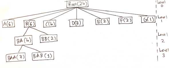
Consider the following four-level hierarchical structure, which we’ll use as the sample input in this series, represented as one such diagram:
The nodes are labeled with letters. Longer labels indicate deeper-level nodes. The label of a child is prefixed by the label of its parent e.g. is a child of , which is in turn a child of . Each node carries a numeric value that is either self-assigned if that node is terminal or the sum of the values of its children if not.
Although such diagrams are useful to visualize small trees, they become less effective when the trees get larger because the diagrams use space inefficiently (most of the pixels are used as background) and because it’s hard for users to grasp the entire picture. Furthermore, the diagrams only show structural relationship; additional information, such as the size and importance of each node, is ignored or has to be supplementally annotated in text form.
Classic tree maps
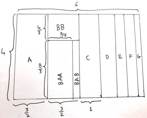
The classic tree map was proposed by Shneiderman as an alternative to node-and-link diagrams. Its two-dimensional space-filling representation is designed to be a better way for humans to visualize complex tree structures. The algorithm proceeds level-by-level through the hierarchy and alternate between horizontal layout for odd-numbered levels and vertical layout for even-numbered levels. Here is how his algorithm works when applied to the problem of visualizing the above sample tree inside a container.
Level 1
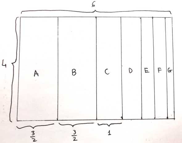
Partition the original container into the same number of rectangles as the number of children at level 1 (seven partitions) in the horizontal direction (left to right). Each child rectangle takes up the full height of the parent container and has a width that is in proportion of its node’s value in relation to the parent’s value. For example, rectangle ’s width is , which is of the parent container’s width () because node has a value of , which is of the node’s value (). After this step, the result looks like this:
In this series, we’ll call such a collection of rectangles laid out in the same direction a row.
Level 2
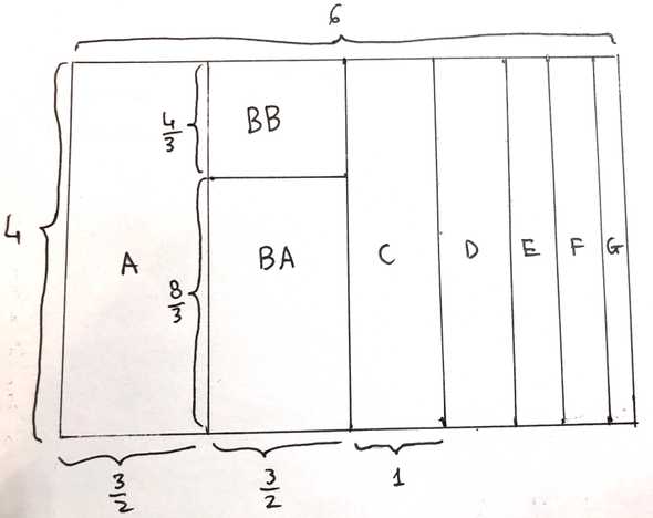
Because only node has children, the layout is done for the other level-one nodes. The layout for level two is done vertically (bottom to top1) rather than horizontally. We partition rectangle into two smaller rectangles corresponding to and , each taking up the full width of and having a height proportional to to their associated numeric values. This is the final result:
Level 3
Because only has children, the layout is done for .
We partition , this time horizontally, into and in proportion to their values.
This is the result:
Squarified tree maps
The main shortcoming of the classic tree map is that it produces thin, elongated rectangles. The squarified tree map algorithm, in addition to partitioning the container into proportional areas, also attempts to produce more square-like rectangles (hence the name “squarified”) by ensuring that the aspect ratios of the rectangles are as close to 1 as possible.
Square-like rectangles offer several advantages:
- Because the number of pixels used for a rectangle’s border is proportional to its circumference, the display space is used more efficiently.
- Square rectangles are easier to detect and point at whereas thin rectangles can create aliasing errors.
- Visual comparison of the sizes of rectangles is easier when their aspect ratios are similar.
Instead of looking for the optimal solution, which would require finding all possible tessellations, whose number is very large, this algorithm returns a good solution that can be computed in a short amount of time.
The squarified algorithm is recursive both breadth-wise and depth-wise:
- Like the classic algorithm, the squarified version considers one level of the tree at a time. Given the original container, we first try to produce square-like rectangles for the set of siblings at the top level. That is, we layout the nodes through inside of the node as if no other nodes exist. Then the starting point for each set of siblings at the next level will be the square-like rectangle of their common parent. For example, the nodes and will be laid out inside of as if all the other nodes didn’t exist. This process is repeated until all nodes at all levels have been laid out. This is the depth-wise recursion.
- Unlike the classic algorithm, when a node is processed, a decision is made between two alternatives. Either the node is added to the current row, or the current row is fixed and a new row is started in the remaining subrectangle. This decision depends on whether adding a rectangle to the current row will make the rectangles in that row more square-like i.e. decrease the maximum aspect ratio among those rectangles. This is the breadth-wise recursion.
Example
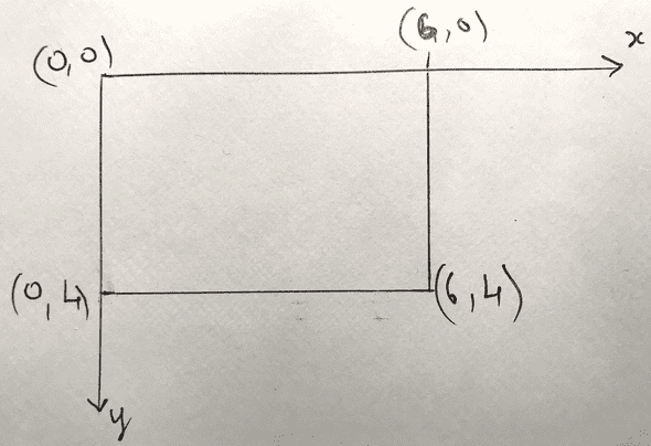
To illustrate how the squarified algorithm works, we’ll once again try to visualize the earlier sample input tree inside a container. The coordinate system used in this article follows the convention in a web browser: increases to the right and increases downward.
Level one
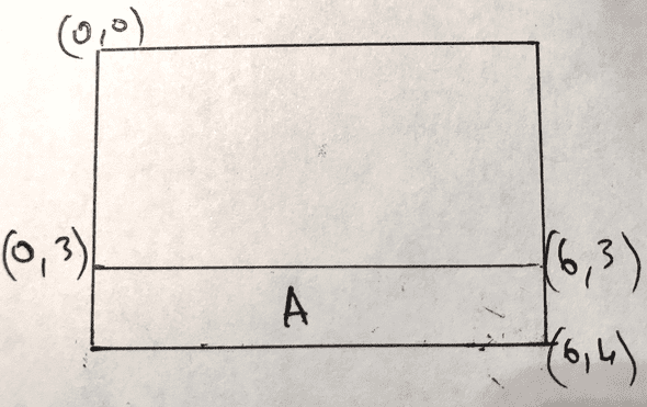
First off, where do we put rectangle (value )? If we lay it out against the container’s long side like this:
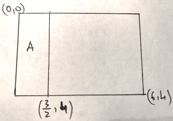
the aspect ratio of will be but if we position it against the shorter side like this:
the aspect ratio of will be only . Because we want the laid out rectangles to be as square-like as possible, we’ll pick the shorter side. In general, we always lay out rectangles against the shorter side of a container (can you convince yourself why?).
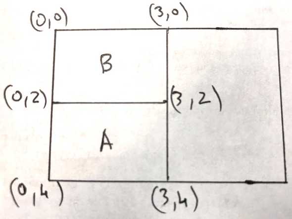
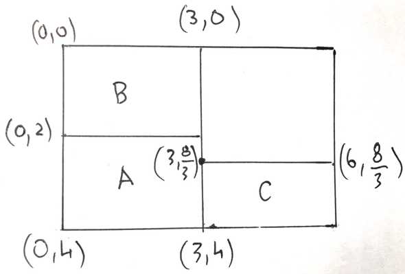
Let’s move on to rectangle with value . As agreed previously, we will only lay out rectangles against the shorter side of their container, meaning will appear above . The choice of putting above instead of below is arbitrary but here we follow the choice made in the paper.
The maximum aspect ratio of the current row (containing and ) decreases to . Because adding improves aspect ratio, this is a good location for .
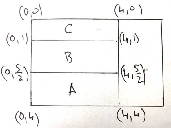
Let’s try to add (value ) to the current row:
However, this causes the row’s maximum aspect ratio to increase to (that of ). Because the aspect ratio is worsened by the addition of to the current row, we’ll start a new row for in the remaining space not occupied by and :
The maximum aspect ratio of the newly created row is that of i.e. .
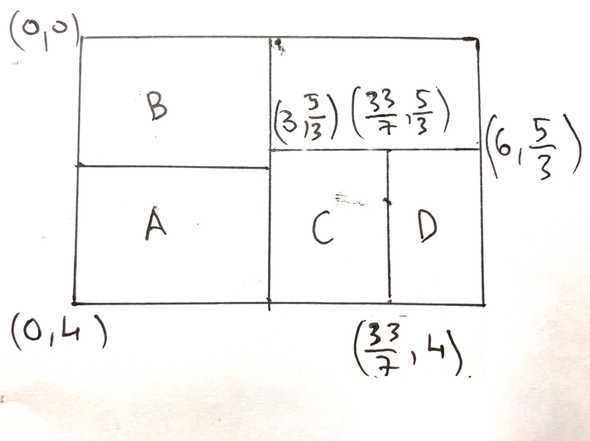
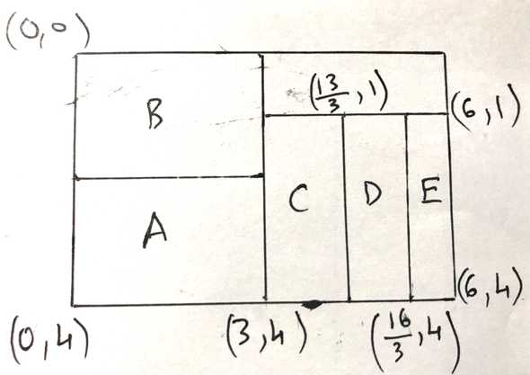
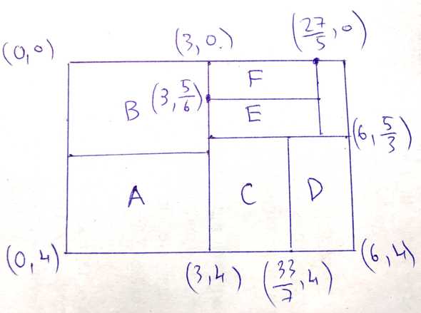
We then add (value ) to the current row (along the container’s shorter side) because it improves the row’s maximum aspect ratio to :
However, adding (value ) to the current row:
increases the row’s maximum aspect ratio to (that of ), which is bad, so we’ll start a new row for in the remaining space not occupied by through :
This new row has a maximum aspect ratio of .
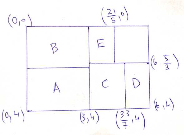
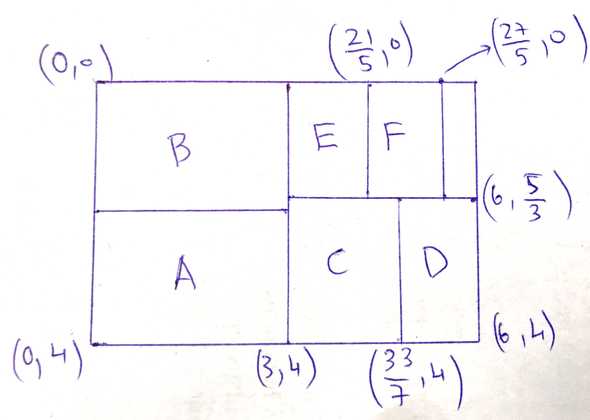
When we try to add (value ) to ’s row, the row’s maximum aspect ratio increases to :
Therefore, we’ll create a new row for in the remaining space. This row has a maximum aspect ratio of .
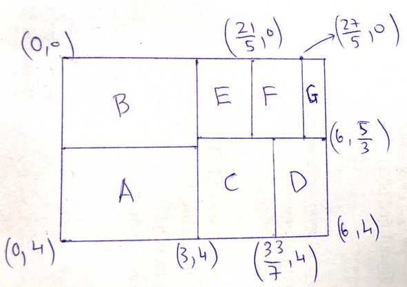
There’s only one spot for (value ) to go into so the final layout looks like this:
Technically, the process here is that we add to ’s row (by placing to the right of ) but that increases the maximum aspect ratio of the row to so we create a new row for , which, because is the last node to be laid out, contains only . Although the visual results of the two choices (adding to current row versus creating a new one) are the same, it’s important to note that we did have to make a decision there.
Levels two and three
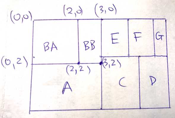
By applying the same reasoning (no pun intended), this is how the level-two nodes ( and ) are laid out inside their parent ():
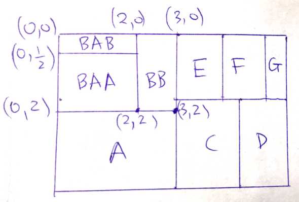
and this is level three’s layout i.e. the final result:
Note that in the final visual output, only terminal nodes of the original input tree remain whereas non-terminal nodes have disappeared.
This is the end of part one. I hope it gives you a sense of how the squarified tree map layout algorithm works. We’ll discuss the implementation in part two.
- The bottom to top direction is chosen for consistency with Bruls’ paper.↩
